Using a Google Fusion Tables Network Graph to Visualize a Conformed Data Model
Documenting data models can be painstakingly boring, but having documentation available when building, modifying and using data models can save time and effort on an order of magnitude. Most documentation is static and lifeless. Over the last few years I’ve been looking for a means by which to document data models that is fun, interactive, intuitive, and engaging for both developers and users.
There are already 13 open data sets that have been modeled and featured at Open Data Bits, and that list will continue to grow. Providing a user-friendly and simple means by which to visualize mashed up data with conformed dimensions is a challenging task. The value of mashed up data is best expressed through effective visualization, and traditional documentation is the antithesis of engaging and intuitive.
Most of the time, data cubes are visualized as rigid and cold multi-faceted three dimensional blocks. New advances with in-memory data models and cubes would benefit from documentation that has the interactive and dynamic look and feel of what I like to call “Gummy Cubes.” If data model documentation were a Gummy Cube it would appear simple, flexible, and visually appealing while inviting interactions that define the nature of the data relationships.
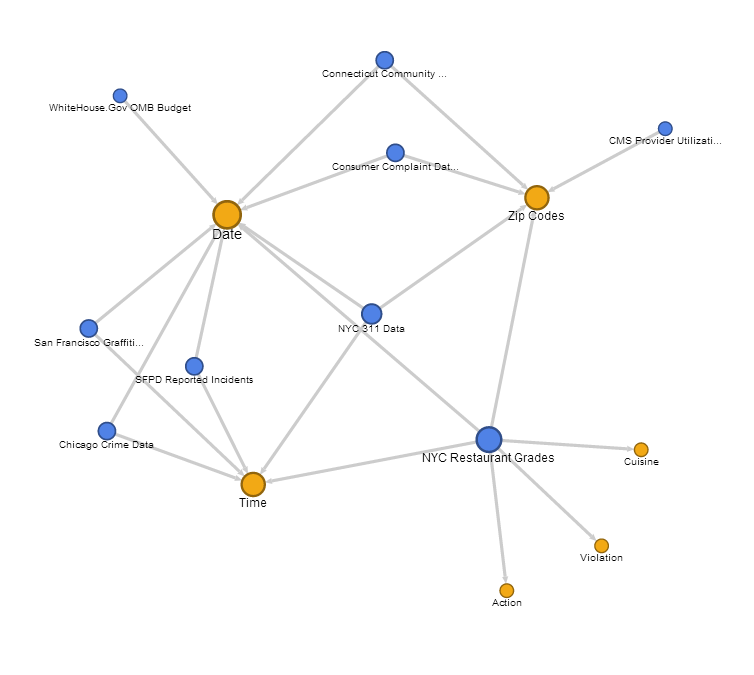
Yesterday I came across Network Graphs in Google Fusion Tables. While Google Fusion Tables are still an experimental app in Google Labs, interactive Network Graphs may provide an approach to turn data modeling documentation into an interactive, intuitive, value added experience. Below is a Google Fusion Tables Network Graph of the open data sets featured so far at Open Data Bits. Go ahead and click on the bubbles, dragging them around:
To state the obvious, Google Fusion Tables Network Graphs do not appear to be specifically designed for data model documentation. However, this tool could become a documentation dynamo with additional features to embed metadata such as embedded links, additional means by which to assign bubble colors and bubble shapes, arrow details, and additional filters.
While Google Fusion Table Network Graphs are still an experimental app, we’ll be using them more as our own documentation evolves at Open Data Bits. There is still great value for organizations in traditional enterprise business intelligence cubes, but the greatest value that emerges from data mashup and visualization technology may come from the affordable, flexible, and intuitive “Gummy Cubes” that individuals can build on their own PCs.
Here’s a few links if you’d like to read more about uses for Google Fusion Table Network Graphs:
How to Create Network Graphs with Google Fusion Tables
Lessons from a Google Fusion Table Graph
Visualize Your Backlinks with Google Fusion Tables
If the embedded visualization in the article above does not work, here’s a screenshot of a Network Graph in Google Fusion Tables: