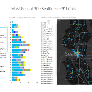
Seattle Real Time Fire 911 Calls API Data pulled into Excel for analysis using Microsoft BI tools Power Pivot, Power Query, & Power View
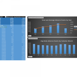
The above video walks through the process by which to use an API to pull data into Excel from a real time database of public information. Note that the database,…
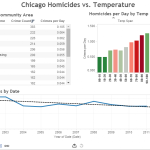
Visualizing the Relationships between Chicago Homicides and Hot Weather
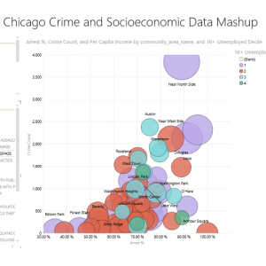
The media frequently speculates about the relationship between hot summer weather and murders in Chicago. With both Chicago crime and daily weather information available to the public as open data,…
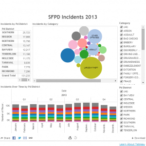
An Interactive Data Visualization Dashboard of San Francisco Police Reports in 2013
San Francisco Police Reports 2013 Dashboard (click the filter values and hover over bubbles and bar graph colors, it's interactive!) Learn About Tableau The above dashboard visualizes San Francisco Police…
A Web Based Interactive Dashboard Using Tableau Public
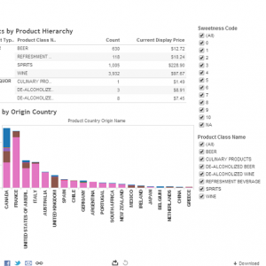
BC Liquor Store Product Price List Dashboard It's a live interactive dashboard, give it a try! Learn About Tableau Yesterday I posted an article detailing the use of a liquor…
Liquor Open Data from British Columbia’s DataBC Platform and BC Liquor Stores
Need a break from browsing accounting ledger open data? Take an hour to browse the BC Liquor Store Product Price list which is available on British Columbia's DataBC open data…
World Bank Forest and Agricultural Data Mashed Up to Visualize Trends
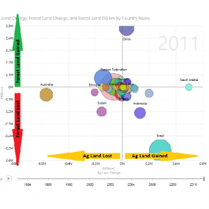
The World Bank provides open data about development in countries across the globe including data about agricultural land and forest area by country over time. Combining both of these data…
Mash Up Minneapolis and New York City Restaurant Inspection Data
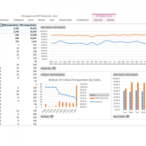
The City of Minneapolis has made restaurant inspection data available to the public as open data. A useful example of how this data can be used and exposed to the…
Video Tutorial on Scatter Charts for Data Visualization
Earlier this month I posted an article reviewing the basic principles of scatter charts for data visualization. The article received quite a few hits and links, so I went ahead…
Pull openFDA API Data into a Pivot Table using Microsoft Excel
The United States Food and Drug Administration has launched a new open data site called openFDA. The site is currently in Beta testing, and provides API access to over 3…
Understanding and Using Scatter Charts – One of the Most Powerful Data Visualization Tools
Bar charts, line charts, and pie charts are the staple data visualization tools that most people use to present and consume data. If you've ever explored the chart types in…

