Visualizing the Relationships between Chicago Homicides and Hot Weather
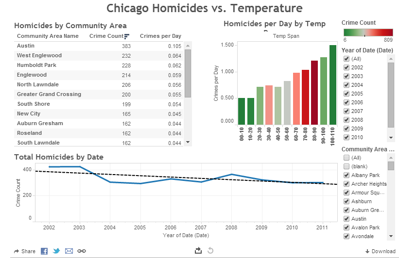
The media frequently speculates about the relationship between hot summer weather and murders in Chicago. With both Chicago crime and daily weather information available to the public as open data, comparing the two phenomena is possible. Below is an interactive data visualization (point and click around on it) of Chicago homicides and weather:
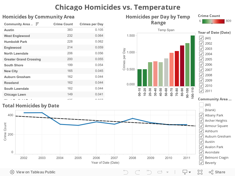
The bar chart in the upper right represents the “Homicide Rate per Day” for each 10 degree span of Fahrenheit degrees. The color of the bars represents the total homicides in that bar. The color red represents the most homicides. Use the filters on the right hand side to filter the data visualization by years or by Chicago Community Area.
Before proceeding further, I should note that not statistical analysis was done on either data set to prove any claims about the data. I have just pulled in publicly available crime data from Chicago, along with publicly available Cook County weather data, and then used free software to create these interactive visualizations. From the above data visualization, it appears that the homicide rate does indeed go up on warmer days.
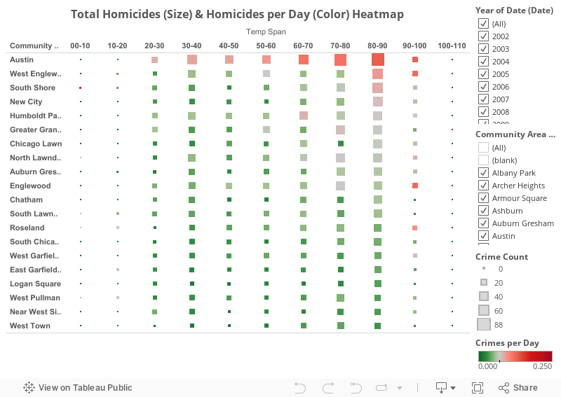
Perhaps some of the eye-catching numbers in the press are backed up by data. However, the yearly homicide total graph at the bottom of the visualization shows that total homicides were trending down from 2002-2011. Are certain neighborhoods more prone to homicide than others? Let’s take a look at an interactive heatmap that shows total homicides by size of each square, and homicides per day as the color of the squares. Each square represents a 10 degree Fahrenheit span for a Chicago Community Area:
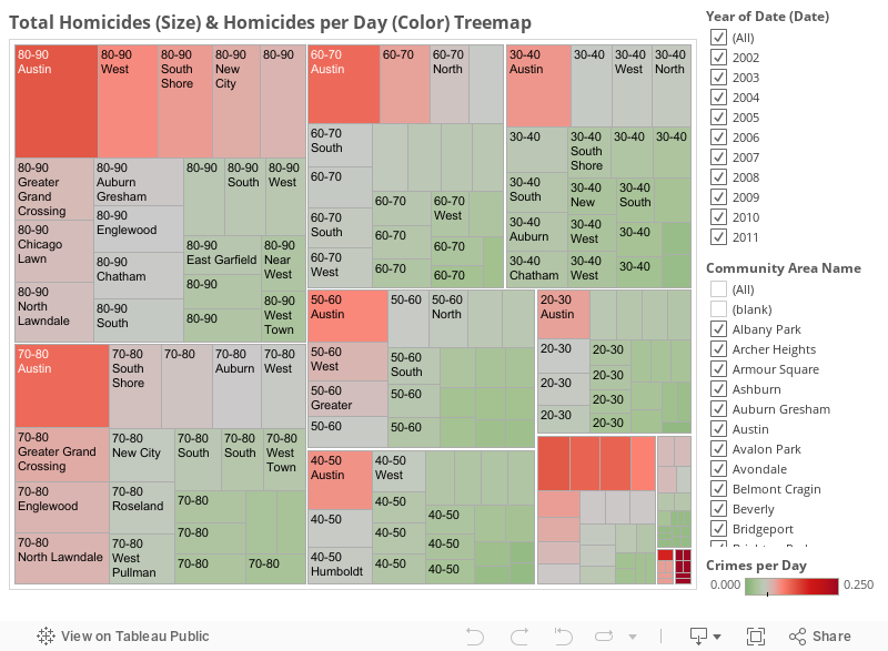
Another way to visualize this relationship is with a treemap. Below it appears clear that more homicides, and more homicides per day happen on warm days in the Community Areas in the upper left:
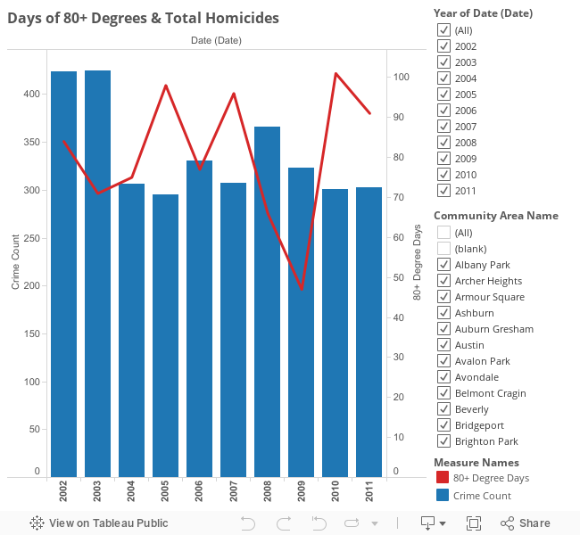
Once again, this article is not attempting to make any claims. I’m just demonstrating that mashing up open data from different sources can be useful and interesting. There are many factors which could impact homicide rates in Chicago. Despite the apparent relationship between hot days and homicides, it appears that hot years do not necessarily result in greater violence. Correlation does not equal causation. Looking at the chart below, years with more hot days did not necessarily translate into a more homicides for the year:
I have written several other articles and recorded a few videos using open data from Chicago. Here are a few links:
Combine Chicago Crime Data with Census Data for New Insights
Instructional Video to Mashup Chicago and San Francisco Crime and Police Open Data
Video Tutorial on Scatter Charts for Data Visualization
City of Chicago Crime Data Now Featured at Open Data Bits
If you’re browser or device doesn’t show the interactive data visualizations, here’s a screenshot to see what you missed: