Video Tutorial on Scatter Charts for Data Visualization
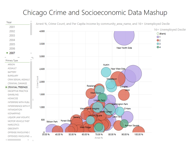
Earlier this month I posted an article reviewing the basic principles of scatter charts for data visualization. The article received quite a few hits and links, so I went ahead and created a video that walks through the basics of scatter charts. The technology used in the video is Power View for Excel 2013. Scatter charts are, in my opinion, the most powerful tool for visualizing multiple data measures and attributes on a single data visualization.