Understanding and Using Scatter Charts – One of the Most Powerful Data Visualization Tools
Bar charts, line charts, and pie charts are the staple data visualization tools that most people use to present and consume data. If you’ve ever explored the chart types in Excel or taken a statistics course, you’ll know that there are numerous other standardized methods for visualizing data. My personal favorite, the scatter chart, may be the most powerful tool for understanding and visualizing data. Keep on reading below to learn the basics of understanding and using a scatter chart, and then see if you agree with me. If you like tutorial videos, I’ve created one which accompanies this article at this link.
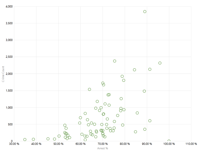
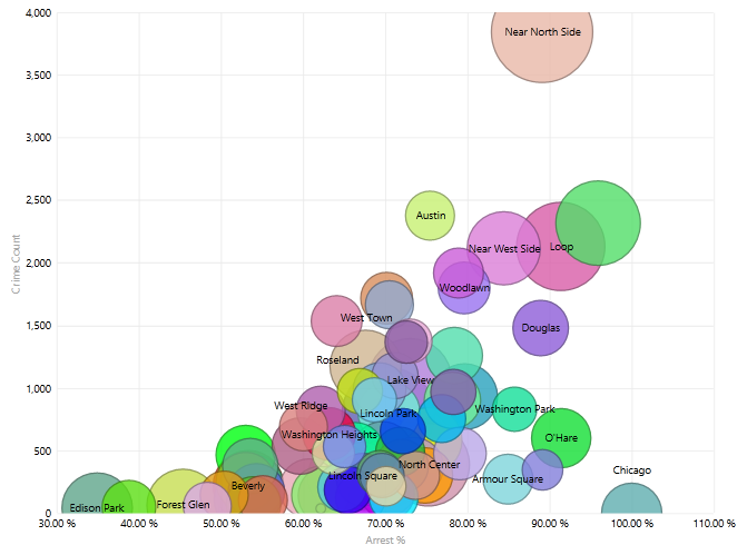
A basic scatter chart plots two different measures against each other. One goes on the x axis, and the other goes on the y axis. Different points on the graph represents some kind of category. The example below plots Crime Count on the y axis versus Arrest % on the x axis. Each point represents a Community Area in the city of Chicago. Learn more about the data set at this link.
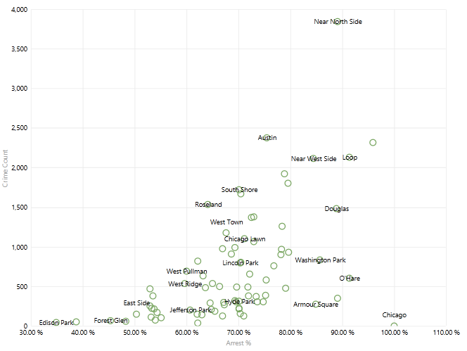
Adding titles to the points clarifies the chart. You can see that within the data, as Crime Count goes up the Arrest % also goes up:
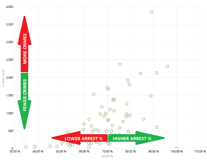
Another way to think about the scatter chart is that for the Community Areas, you can see if there is a pattern as each measure goes up or down:
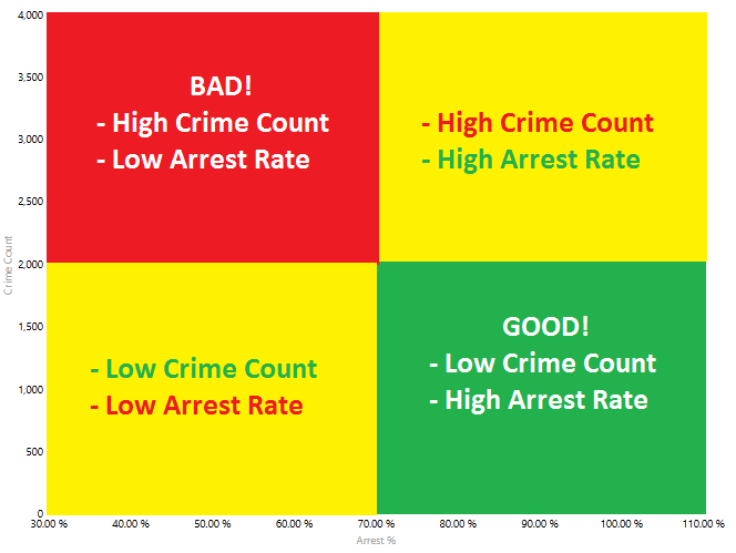
Using the four arrows above, each Community Area could fall into one of 4 categories:
- High Crime Count, Low Arrest %
- High Crime Count, High Arrest %
- Low Crime Count, Low Arrest %
- Low Crime Count, High Arrest %
On the scatter chart, each Community Area would fall into one of these four quadrants:
Are you ready to add another measure to the scatter chart? Here’s where the value of scatter charts as data visualization tools starts getting robust. Adding Per Capita Income to the scatter chart so that it is represented by the bubble (point) size gives you three different measures on the same chart, for the same Community Areas. The larger the bubble, the higher the Per Capita Income:
How about adding another measure to the scatter chart? You can also have the bubble color represent the 16+ Unemployed Decile. Now purple bubbles represent Community Areas with 0-10% unemployment, and green bubbles have 30% or higher unemployment:
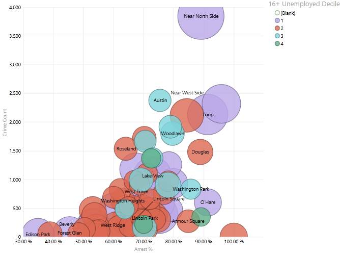
So now there are four different measures representing each Community Area:
- Crime Count – x axis
- Arrest % – y axis
- Per Capita Income – bubble size
- 16+ Unemployed Decile – bubble color
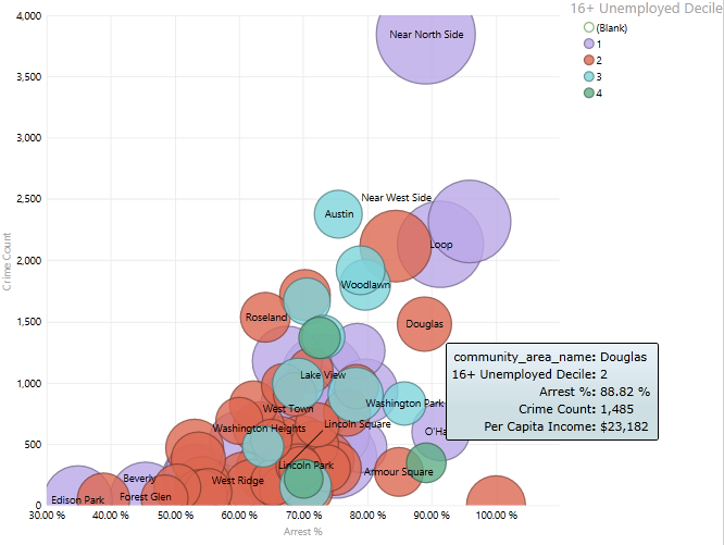
In the business intelligence tool that I used for the graphics, I can hover over a bubble to see all of those values for that Community Area:
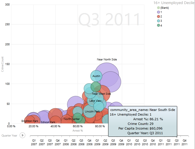
Can we add another level of complexity for the scatter chart? Adding a time value to a scatter chart allows you to watch the bubbles move over time. Think of it as a “play button” for a DVD movie. A more detailed description of this scatter chart feature is available at this link. In the example below you can see that in Q1 of 2007, the Near South Side had a high Crime Count, a high Arrest %, a large Per Capita Income, and 10-20% unemployment:
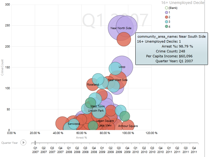
By Q3 of 2011, the Crime Count has gone down significantly and the Arrest % has only declined slightly:
In summary, scatter charts have the ability to plot many different measures and categories on a single chart. If designed properly, patterns are often easily recognizable using nothing more than a data visualization tool.
Below is a video I created to summarize this article:
A famous TED talk features statistics maestro Hans Rosling as he uses motion scatter charts to debunk myths about the developing world:
If you’d like a video demonstration of the examples provided in this article, I created a video last week that walks you through the process by which to use dynamic motion scatter charts: