San Francisco Graffiti Reports and SFPD Reported Incidents Data Mashup
The open data sets previously featured at Open Data Bits were both from the city of San Francisco, and they both contained latitude and longitude coordinates. It is only the next logical step to mash-up the SFPD Reported Incidents and San Francisco Graffiti Reports data sets so that the geographical distribution of both data sets can be viewed on a map with dynamic parameters.
UPDATE: This data set has a new documentation page that is designed to provide a step-by-step guide for integration into a business intelligence solution. Click here to visit that new page for SFPD Incidents, and click here for the new page about San Francisco Graffiti Reports.
For details and guidance about accessing and modeling the SFPD Reported Incidents and San Francisco Graffiti Reports open data sets please refer to the following posts and pages on this site:
San Francisco Graffiti Reports Open Data
San Francisco Police Department Reported Incidents Open Data
Open Data Bits Sources and Modeling
Mashing Up the Data Sets
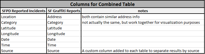
Both the San Francisco Graffiti Reports and SFPD Reported Incidents data are at the granularity of a single reported incident per row of data. Although the two data sets are different types of events, displaying a count of each event on a map can yield an interesting geographical data visualization. For the data mashup, Open Data Bits performed the equivalent of a SQL “Union All” statement using Power Query for Excel 2013. Various business intelligence tools will have different methods to union tables together, but the following columns from both tables can be used to reproduce the visualizations for this feature:
The conformed Open Data Bits Date and Time dimensions can also be used with the mashed-up data table in order to provide hierarchical rollups in the reports.
Visualizing the Data
There are numerous business intelligence tools that can be used to visualize the data mashup. For the example below, the solution was built in Power Pivot and is displayed using Power View for Excel 2013.
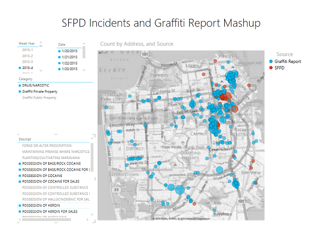
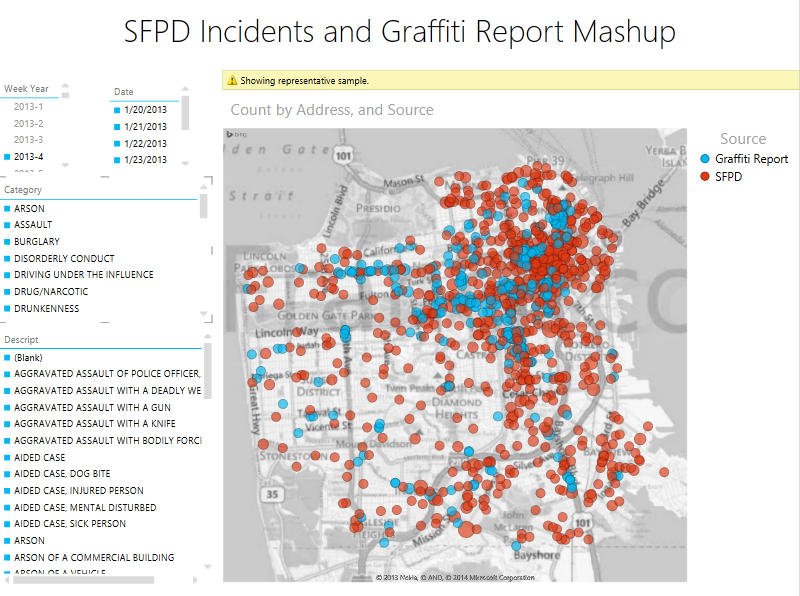
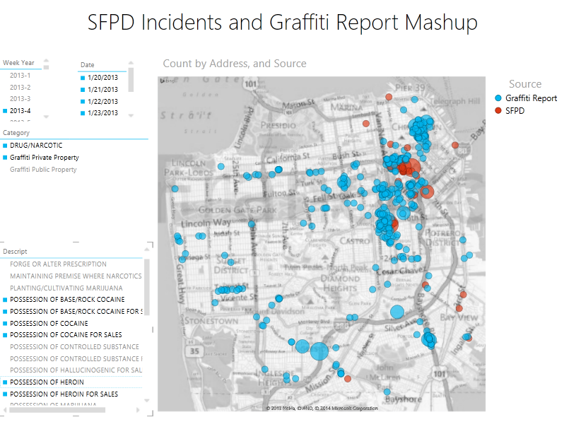
The map below contains slicers for [Week Year], [Date], [Category], and [Description]. The [Week Year] is selected for the fourth week of 2013. Any of these slicers can be used to dynamically change the data that is displayed on the map. The map contains blue circles representing a count of graffiti reports, and red circles for SFPD incidents. Notice the warning at the top of the map stating that there are too many data points to visualize on the map simultaneously:
Selecting the [Category] slicer members “DRUG/NARCOTIC” (from SFPD) and “Graffiti Private Property” (from Graffiti Reports) narrows down the events that are mapped for week 4 of 2013:
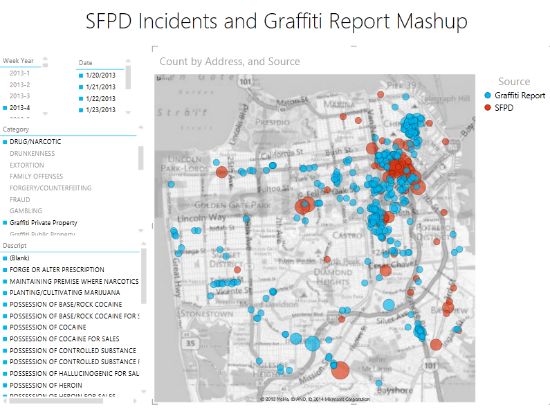
Selecting a few members of the [Descript] slicer (SFPD data) related to cocaine and hard drugs then filters the map to show what appears to be a tendency for both graffiti and SFPD incidents to happen in close proximity to one another:
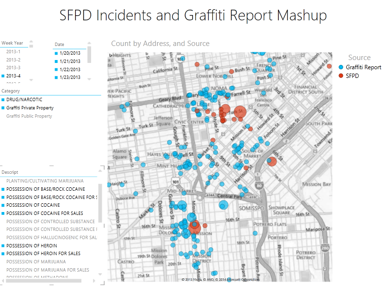
Zooming in on the cluster in the northeast part of the city reveals more details about the geographic locations of both the SFPD and San Francisco graffiti events:
Feedback and suggestions are always welcome to help Open Data Bits improve our content to better suit your needs.