Canada 2012 HIV/AIDS Attitudinal Tracking Survey Open Data
The 2014 Canadian Open Data Summit is taking place in Vancouver today, February 21. In the spirit of the convention, an open data set from the Canadian government will be featured in this article. Data.gc.ca has survey results available as open data for a 2012 HIV/AIDS Attitudinal Tracking Survey. When viewed on an interactive dashboard, this data set is very interesting to browse.
UPDATE: This data set has a new documentation page that is designed to provide a step-by-step guide for integration into a business intelligence solution. Click here to visit that new page.
Accessing the Data
Canada’s 2012 HIV/AIDS Attitudinal Tracking Survey open data can be found at the following link:
http://data.gc.ca/data/en/dataset/f79b3ec4-5b50-4ec1-894d-e9855148e55d
The page contains information about the data set along with documentation about the data which is available in a .doc format at this link. A connection was set up to the .csv html link using the Excel 2013 add-in Power Query, and then added to a data model in Power Pivot.
Modeling the Data
Canada’s 2012 HIV/AIDS Attitudinal Tracking Survey open data is very simple to model. The granularity appears to be a survey response, and there is not a date or time field. Eventually Open Data Bits will add a conformed dimension for Canadian provinces, but for this example the provinces will be left as normalized columns on the survey results table. For future use with other open data sets the table has still been added to the Open Data Bits Logical Model which can be found at this link.
The columns from the 2012 HIV/AIDS Attitudinal Tracking Survey open data have been added to the Open Data Bits Sources and Modeling table which can be found at this link.
Hierarchies
There were no apparent natural hierarchies in the data.
Metrics
The following metrics were added to the featured solution by Open Data Bits:
- Survey Count – A count of rows in the table represents a count of survey responses.
- Diabetes Very or Somewhat Serious % – A percentage of respondents who considered diabetes to be a”Very Serious” or “Somewhat Serious” disease.
- HIV-AIDS Very or Somewhat Serious % – A percentage of respondents who considered HIV/AIDS to be a”Very Serious” or “Somewhat Serious” disease.
Visualizing the Data
The data visualization examples below were built in Power View with a Power Pivot source from Excel 2013.
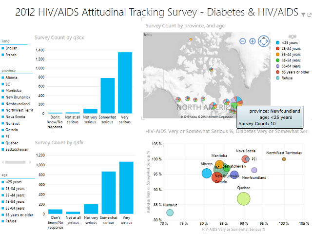
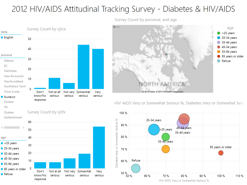
Starting at a high level of rolled up data the slicers for primary language, province, and age are on the left hand side of the report. Responses for the “Diabetes” severity question (q3cx) are on the top bar chart, and responses for the “HIV/AIDS” severity question (q3fx) are on the bottom bar chart. A map displaying respondent count by age group and province is on the top right. The bottom right scatter chart displays the percentage of respondents who consider diabetes a “very serious” or “somewhat serious” condition are on the y axis, and for HIV/AIDS on the x axis. Each bubble represents a province, and the size of the bubble represents the count of respondents:
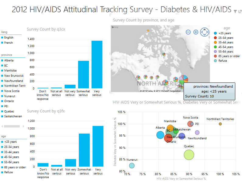
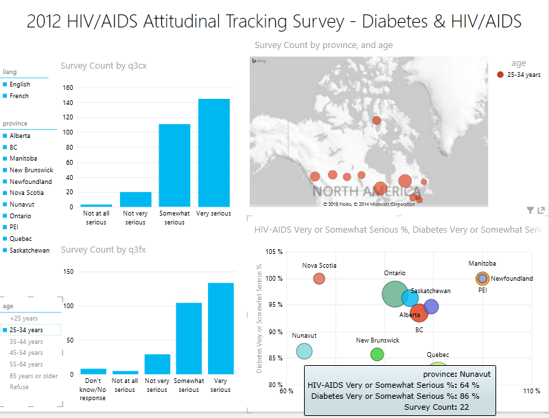
Clicking the slicer for “25-34 years” filters all of the charts on the report. Notice that in that age group, of the 22 respondents from Nunavut 86% consider diabetes to be a “Very Serious” or “Somewhat Serious” disease while only 64% responded that HIV/AIDS was a “Very Serious” or “Somewhat Serious” disease:
Selecting the province slicer value for “Nunavut” yields the bar chart values for diabetes (top) and HIV/AIDS (bottom): 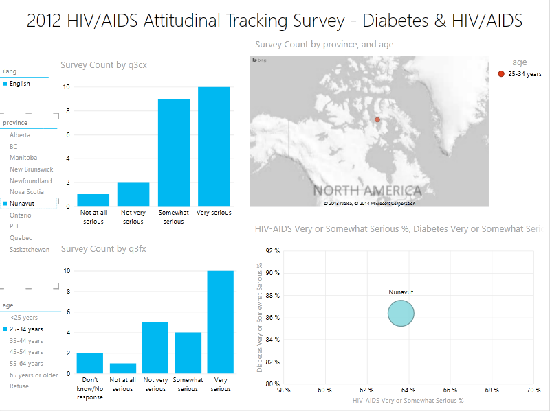
Finally, clearing the age filter and drilling into the bubble chart yields the differences in survey results among different age groups:
As noted in previous articles, advice and feedback are welcome as either comments on this page or as messages on our Feedback page.